In the following guide, we will use demo data of the office space in the pilot company.
Open the ShowMe app https://showme.wappsto.com/ and follow the instructions below.
1. Define baseline in your energy consumption
In ShowMe app Dashboard, the first thing you will see is the ‘Explore your data‘ widget.
To simplify our data exploration,
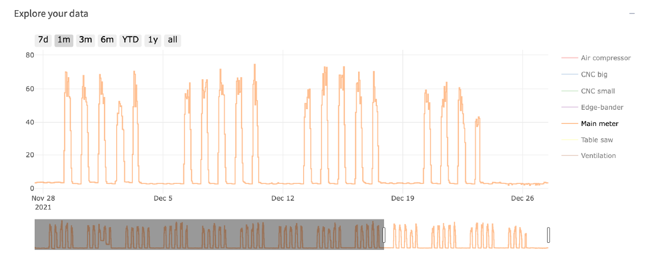
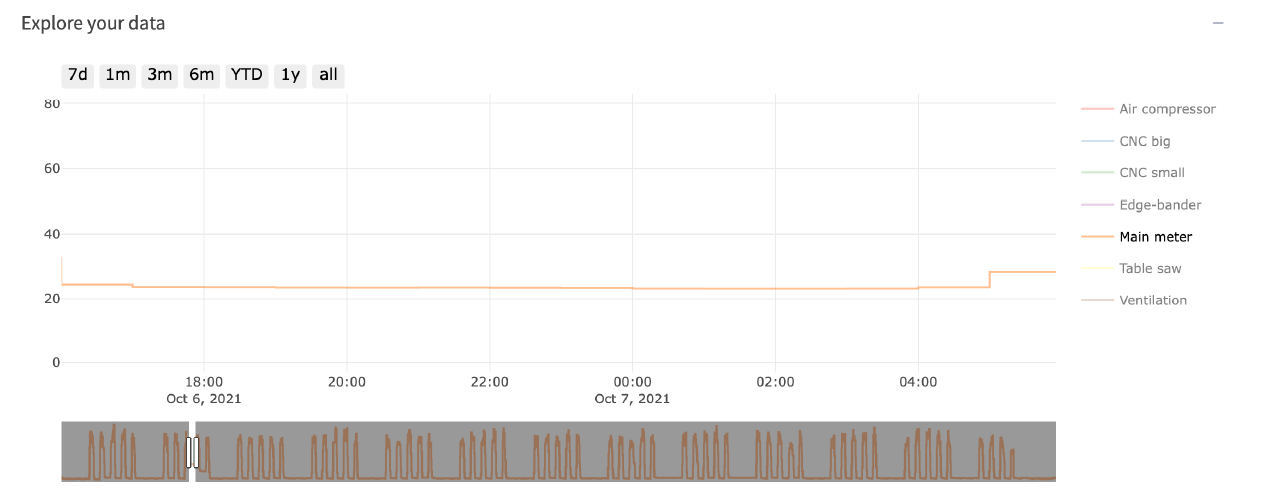
- select 1-month data (“1m” button left, top of the chart),
- and deselect all the meters from the legend (clicking on the name of the meter you want to deselect, the legend is on the right of the chart), as it is shown in the image.
Chart naviagation
Zooming into data
When you are zooming into data in the “Explore your data” widget, all the other widgets change their selected period accordingly.

When “Zoom” is selected you can press and drag over the specific data to zoom in.

You can use the “+” or “-” buttons to zoom in or out. Use the Autoscale button to reset zooming and come back to the initial data view.
2. Find Baseline Irregularity
Even though we have procedures to minimize energy waste, sometimes things go wrong. Such events can be seen as a disturbance in the otherwise repetitive pattern of the Baseline.
Let’s start by resetting our zoom level. Press the “Autoscale” button or “all” and find the disturbance in the usage pattern.
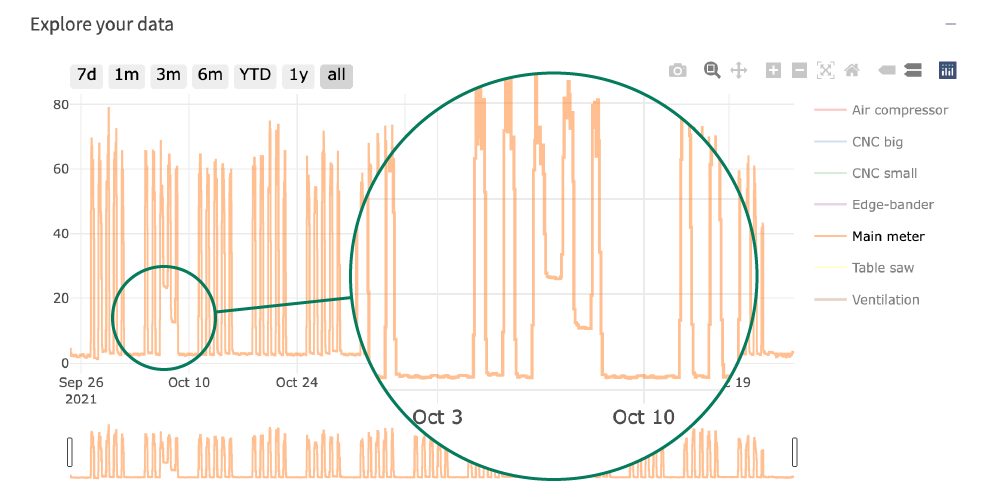
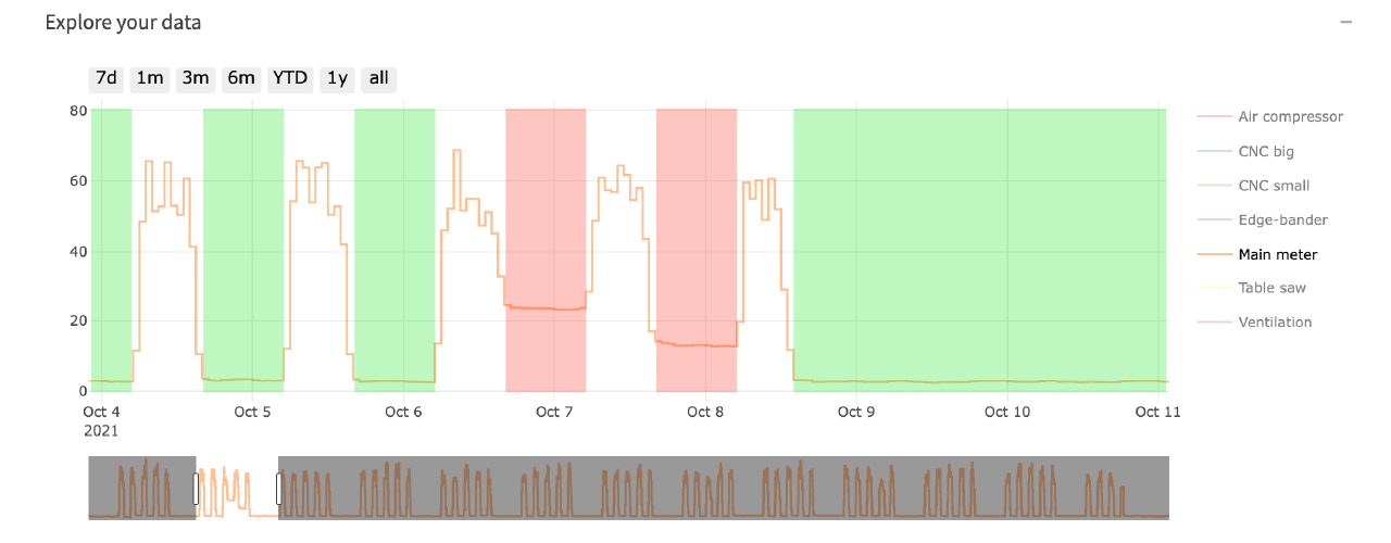
By zooming into the week from 4th to 11th October, we can clearly see the irregularity.
We have marked the irregularity in red and the regular idle power consumption in green for clarity.
3. Calculate the Baseline Irregularity cost
In this example, we will calculate the price ourselves assuming that the price per kWh is 4 DKK.
In the previous section, we had a regular baseline marked in green. By zooming in on that area (~12 hours between the 4th and 5th of October), we get 164.2kWh of total energy usage in the “Energy consumption widget”.
By zooming in on the irregular (red area of ~12 hours between the 6th and 7th of October) we get 371.9kWh of total energy usage in the “Energy consumption widget”.
(371.9 – 164.2) * 4 = 830.8 DKK
4. Find out when is the energy used.
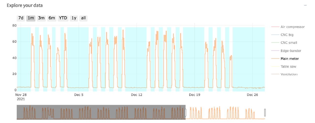
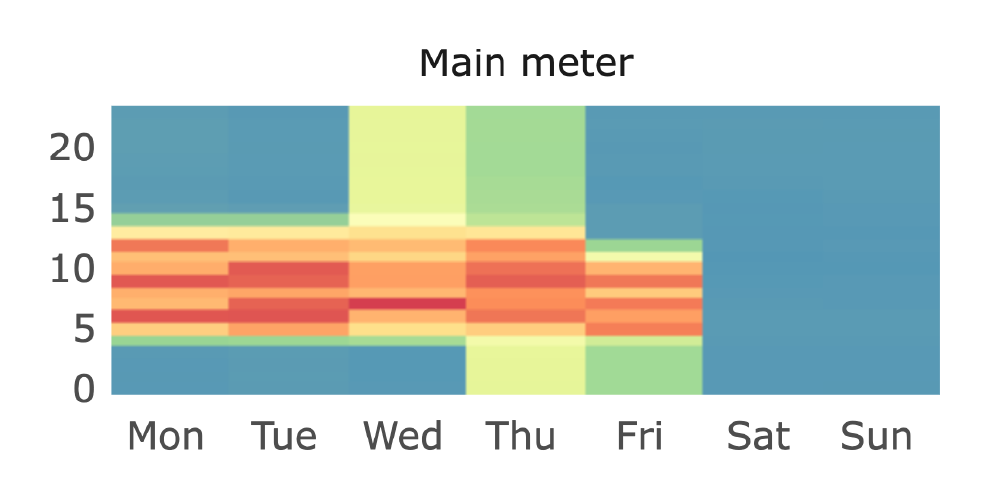
Seluxit EMS will also generate a “Heatmap” of your energy consumption. In the Heatmap widget, you can clearly see when you use the most energy. The energy usage should coincide with when the company produces goods or when people are in the office.
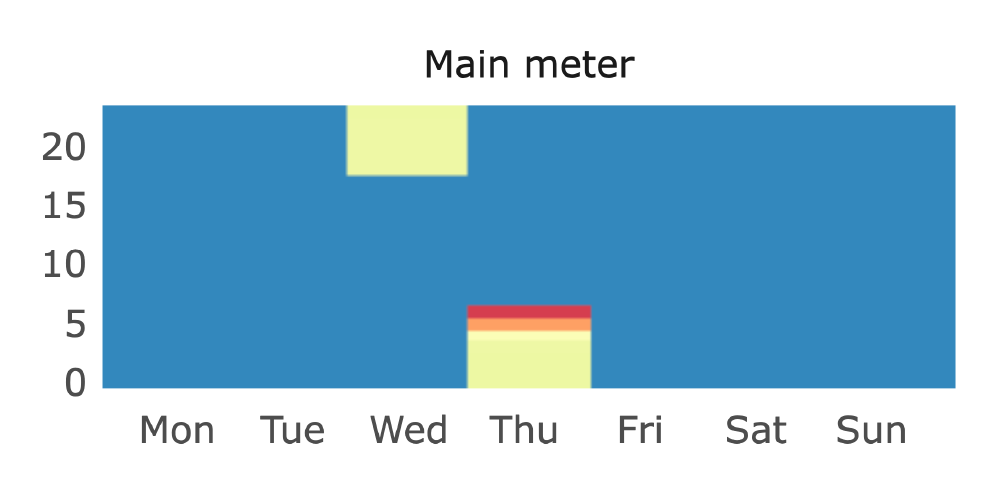
The below images display the same time period as the irregularity above. From this heatmap, you can draw a conclusion that an electronic device was not switched off during the night as expected.
Conclusion
Now you have the tools and ideas on how to find waste in your energy consumption.
You can import your electricity data into our cloud and using the ShowMe analysis app, find patterns and disturbances in the patterns which can indicate waste.
Use the link to the link below to help you get started with data import. The guide currently supports Denmark’s energy utility data import.
Next step?
Learn more about where energy is used and by which electronic devices.
If you already have smart plugs or on-off switches installed, you can act on energy waste reduction and set up automated schedules. Follow the link below for more info.
